
Plotting with Marsilea#
Marsilea builds a figure from separate plots that you place yourself, instead of one function call with many arguments.
It can read from an AnnData directly, so you don’t pull arrays out by hand.
This page needs anndata 0.13 or newer and statannotations for the significance tests.
Let’s first load the PBMC dataset.
from __future__ import annotations

import numpy as np
import pandas as pd

import scanpy as sc

pbmc = sc.datasets.pbmc3k_processed().raw.to_adata()
pbmc
AnnData object with n_obs × n_vars = 2638 × 13714
    obs: 'n_genes', 'percent_mito', 'n_counts', 'louvain'
    var: 'n_cells'
    uns: 'draw_graph', 'louvain', 'louvain_colors', 'neighbors', 'pca', 'rank_genes_groups'
    obsm: 'X_pca', 'X_tsne', 'X_umap', 'X_draw_graph_fr'
    obsp: 'distances', 'connectivities'
    layers: None (.X)
Define the cells and markers that we want to draw.
cell_markers = {
    "CD4 T cells": ["IL7R"],
    "CD14+ Monocytes": ["CD14", "LYZ"],
    "B cells": ["MS4A1"],
    "CD8 T cells": ["CD8A"],
    "NK cells": ["GNLY", "NKG7"],
    "FCGR3A+ Monocytes": ["FCGR3A", "MS4A7"],
    "Dendritic cells": ["FCER1A", "CST3"],
    "Megakaryocytes": ["PPBP"],
}

cells, markers = [], []
for c, ms in cell_markers.items():
    cells += [c] * len(ms)
    markers += ms

uni_cells = list(cell_markers.keys())
cell_colors = [
    "#568564",
    "#DC6B19",
    "#F72464",
    "#005585",
    "#9876DE",
    "#405559",
    "#58DADA",
    "#F85959",
]
cmapper = dict(zip(uni_cells, cell_colors, strict=True))
Import Marsilea, and A, the accessor that names parts of an AnnData.
import marsilea as ma
import marsilea.plotter as mp
from anndata.acc import A
Heatmap#
The smallest example, a heatmap and nothing else. height and width set the size of the
main plot in inches.
Marsilea takes any array, so you can always pass a matrix you built yourself:
exp = pbmc[:, markers].X.toarray()

m = ma.Heatmap(exp, cmap="viridis", height=3.5, width=3)
m.render();
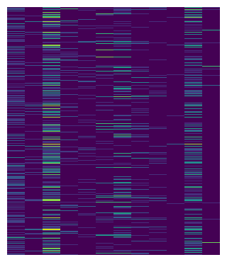
But exp is a copy of pbmc, and you need to copy more from pbmc to add more components to the heatmap. To simplify the syntax, pass the anndata object instead, and name what you want with A.
A.X[:, markers] is one reference per gene, stacked into a matrix. No subsetting, no
.toarray().
m = ma.Heatmap(pbmc, A.X[:, markers], cmap="viridis", height=3.5, width=3)
m.render();
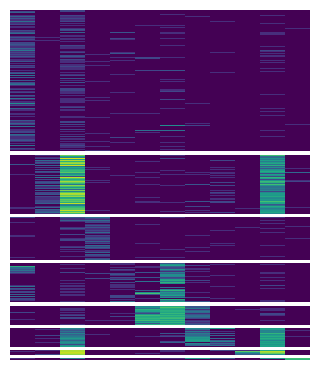
To match the scanpy heatmap, first split it by cell type.
We use group_rows to split the heatmap by categorical group labels louvain.
m.group_rows(A.obs["louvain"])
m.render();
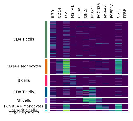
Now let’s label the cell types and the marker names.
add_left, add_top and the other add_* methods attach a plot to one side of the main
plot. Such a plot is called a plotter; there are many plotters in Marsilea. size and pad set how much room it gets and how
far it sits from its neighbor.
# Create plotters
chunk = mp.Chunk(uni_cells, rotation=0, align="center")
colors = mp.Colors(A.obs["louvain"], palette=cmapper)
label_markers = mp.Labels(markers)

# Add to the heatmap
m.add_left(colors, size=0.1, pad=0.1)
m.add_left(chunk)
m.add_top(label_markers, pad=0.1)
m.render();
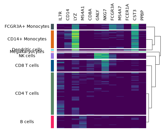
A dendrogram shows how similar the cell types are. Use add_dendrogram and add it to the right.
m.add_dendrogram("right", add_base=False)
m.render();
add_legends collects every legend at once and lays them out for you. add_title adds a
title.
m.add_legends()
m.add_title("Expression Profile")
m.render();
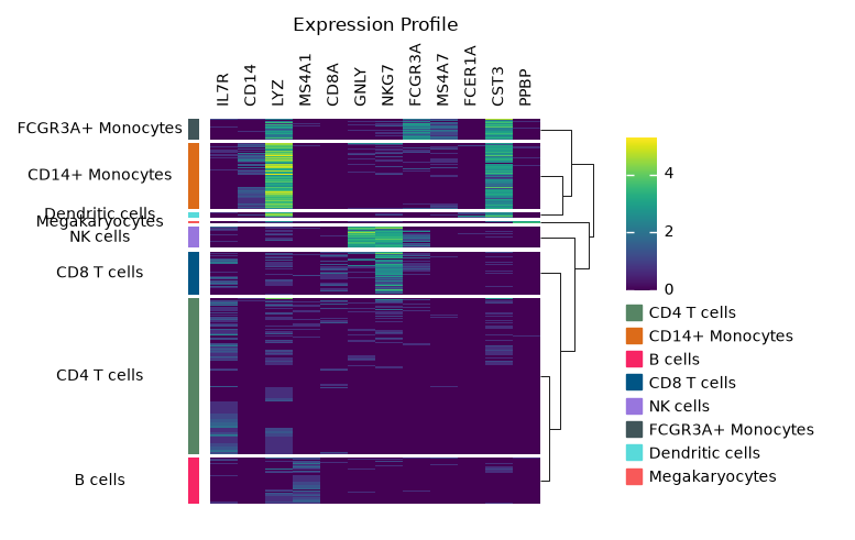
The whole thing in one place. Three things to remember:
Always call
render()last, or nothing is drawn.The order of
add_*calls sets the order of the plotters.group_rowsandgroup_colscan be called at any point.
m = ma.Heatmap(pbmc, A.X[:, markers], cmap="viridis", height=4, width=3)
m.group_rows(A.obs["louvain"])

m.add_left(mp.Colors(A.obs["louvain"], palette=cmapper), size=0.1, pad=0.1)
m.add_left(mp.Chunk(uni_cells, rotation=0, align="center"))
m.add_top(mp.Labels(markers), pad=0.1)
m.add_dendrogram("right", add_base=False)

m.add_legends()
m.add_title("Expression Profile")
m.render();
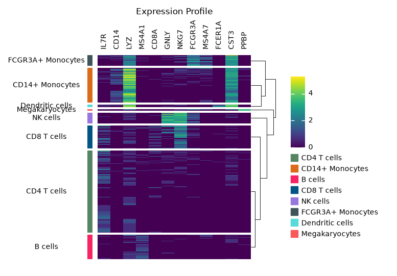
That covers the basics. The same pieces can rebuild plots scanpy already has.
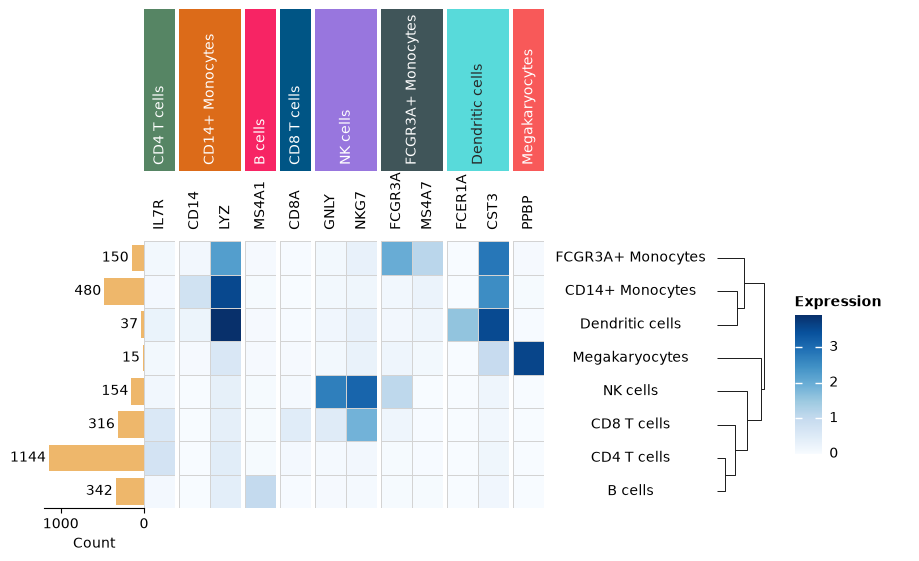
The next few plots summarise cell types rather than cells, so aggregate first.
aggregate() takes a reference for by, and writes the group sizes to
n_obs_aggregated so you do not have to count them.
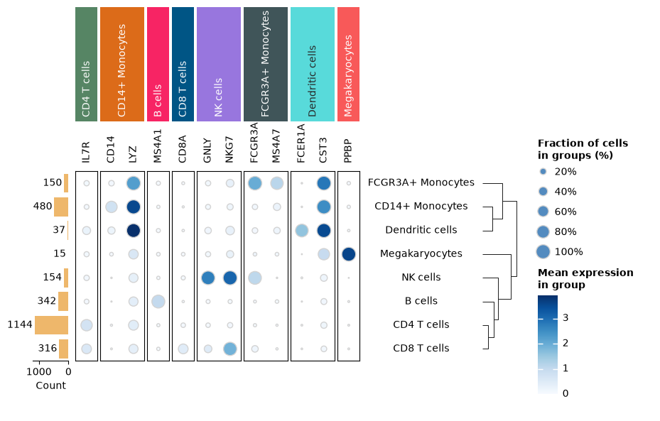
Two more things go in here: the fraction of cells expressing each gene, drawn by the dot plot as dot size, and the lineage of each cell type, used by the significance section.
lineages = {
    "CD4 T cells": "Lymphoid",
    "CD14+ Monocytes": "Myeloid",
    "B cells": "Lymphoid",
    "CD8 T cells": "Lymphoid",
    "NK cells": "Lymphoid",
    "FCGR3A+ Monocytes": "Myeloid",
    "Dendritic cells": "Myeloid",
    "Megakaryocytes": "Myeloid",
}

agg = sc.get.aggregate(
    pbmc[:, markers], by=A.obs["louvain"], func=["mean", "count_nonzero"]
)
agg.layers["fraction"] = (
    agg.layers["count_nonzero"] / agg.obs["n_obs_aggregated"].to_numpy()[:, np.newaxis]
)
agg.obs["lineage"] = pd.Categorical(
    [lineages[c] for c in agg.obs["louvain"]], categories=["Lymphoid", "Myeloid"]
)
agg
AnnData object with n_obs × n_vars = 8 × 12
    obs: 'louvain', 'n_obs_aggregated', 'lineage'
    var: 'n_cells'
    layers: 'mean', 'count_nonzero', 'fraction'
Matrixplot#
h, w = agg.shape

m = ma.Heatmap(
    agg,
    A.layers["mean"][:, :],
    height=h / 3,
    width=w / 3,
    cmap="Blues",
    linewidth=0.5,
    linecolor="lightgray",
    label="Expression",
)
m.add_right(mp.Labels(A.obs.index, align="center"), pad=0.1)
m.add_top(mp.Labels(A.var.index), pad=0.1)
# Use 'order=' to control the order of groups
m.group_cols(cells, order=uni_cells)
m.add_top(mp.Chunk(uni_cells, fill_colors=cell_colors, rotation=90))
m.add_left(mp.Numbers(A.obs["n_obs_aggregated"], color="#EEB76B", label="Count"))
m.add_dendrogram("right", pad=0.1)
m.add_legends()
m.render();
Dot plot#
m = ma.SizedHeatmap(
    agg,
    A.layers["fraction"][:, :],
    A.layers["mean"][:, :],
    cluster_data=A.layers["fraction"][:, :],
    height=h / 3,
    width=w / 3,
    edgecolor="lightgray",
    cmap="Blues",
    size_legend_kws=dict(
        colors="#538bbf",
        title="Fraction of cells\nin groups (%)",
        labels=["20%", "40%", "60%", "80%", "100%"],
        show_at=[0.2, 0.4, 0.6, 0.8, 1.0],
    ),
    color_legend_kws=dict(title="Mean expression\nin group"),
)

m.add_top(mp.Labels(A.var.index), pad=0.1)
m.add_top(mp.Chunk(uni_cells, fill_colors=cell_colors, rotation=90))
m.group_cols(cells, order=uni_cells)

m.add_right(mp.Labels(A.obs.index, align="center"), pad=0.1)
m.add_left(
    mp.Numbers(A.obs["n_obs_aggregated"], color="#EEB76B", label="Count"),
    size=0.5,
    pad=0.1,
)
m.add_dendrogram("right", pad=0.1)
m.add_legends()
m.render();
Combining plots: Dot plot + Heatmap#
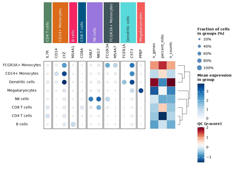
You may want to combine multiple plots in one figure. + puts two boards side by side, / stacks them, and add_legends on the result gathers the legends from both.
Here we show an example of a dot plot sitting next to per-cell-type QC.
from scipy.cluster.hierarchy import linkage

qc_metrics = ["n_genes", "percent_mito", "n_counts"]
qc = pbmc.obs.groupby("louvain", observed=True)[qc_metrics].mean()
agg.obsm["qc"] = ((qc - qc.mean()) / qc.std()).to_numpy()
Each plot clusters its own data, so the two would order their rows differently and stop lining up. We need to compute the linkage once and pass it to both, and only one needs to draw the dendrogram.
row_linkage = linkage(agg.layers["mean"], method="average")

dots = ma.SizedHeatmap(
    agg,
    A.layers["fraction"][:, :],
    A.layers["mean"][:, :],
    height=h / 3,
    width=w / 3,
    edgecolor="lightgray",
    cmap="Blues",
    size_legend_kws=dict(
        colors="#538bbf",
        title="Fraction of cells\nin groups (%)",
        labels=["20%", "40%", "60%", "80%", "100%"],
        show_at=[0.2, 0.4, 0.6, 0.8, 1.0],
    ),
    color_legend_kws=dict(title="Mean expression\nin group"),
)
dots.add_left(mp.Labels(A.obs.index, align="center"), pad=0.1)
dots.add_top(mp.Labels(A.var.index), pad=0.1)
dots.group_cols(cells, order=uni_cells)
dots.add_top(mp.Chunk(uni_cells, fill_colors=cell_colors, rotation=90))
dots.add_dendrogram("left", linkage=row_linkage, show=False)

qc_panel = ma.Heatmap(
    agg,
    [A.obsm["qc"][:, i] for i in range(len(qc_metrics))],
    height=h / 3,
    width=len(qc_metrics) / 3,
    cmap="RdBu_r",
    linewidth=0.5,
    linecolor="lightgray",
    label="QC (z-score)",
)
qc_panel.add_top(mp.Labels(qc_metrics), pad=0.1)
qc_panel.add_dendrogram("right", linkage=row_linkage, pad=0.1)

# 0.2 is the padding between the two plots
comp = dots + 0.2 + qc_panel
comp.add_legends()
comp.render();
Significance annotation#
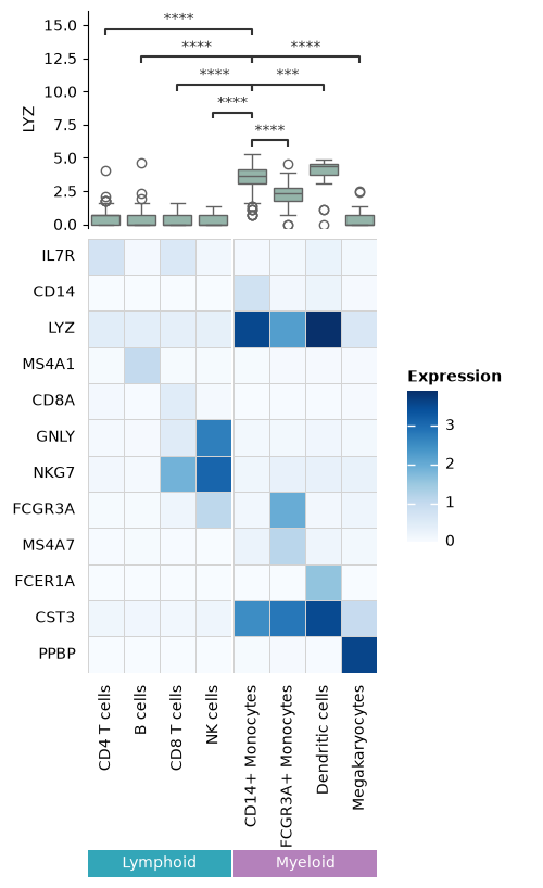
Every seaborn-backed plotter can test pairs of categories and draw the result: Bar,
Box, Boxen, Violin, Point, Strip and Swarm. The tests come from
statannotations.
These plotters read wide data, one column per category. Cell types have different sizes, so
the short columns need NaN padding. Marsilea drops that padding before testing, and warns
if a bracket ends up with no label.
def by_cell_type(gene):
    """Expression of one gene, one column per cell type, NaN-padded to equal length."""
    values = pbmc[:, gene].X.toarray().ravel()
    louvain = pbmc.obs["louvain"]
    return pd.DataFrame({
        cell_type: pd.Series(values[(louvain == cell_type).to_numpy()])
        for cell_type in louvain.cat.categories
    })


by_cell_type("LYZ").iloc[:4]
| CD4 T cells | CD14+ Monocytes | B cells | CD8 T cells | NK cells | FCGR3A+ Monocytes | Dendritic cells | Megakaryocytes | |
|---|---|---|---|---|---|---|---|---|
| 0 | 0.693147 | 3.218876 | 1.386294 | 0.693147 | 0.000000 | 1.386294 | 3.951244 | 0.000000 |
| 1 | 1.098612 | 4.025352 | 0.693147 | 0.693147 | 0.000000 | 1.791759 | 4.532599 | 2.484907 |
| 2 | 0.000000 | 3.871201 | 0.693147 | 0.693147 | 0.693147 | 2.639057 | 3.761200 | 2.397895 |
| 3 | 0.000000 | 4.158883 | 0.693147 | 0.000000 | 0.000000 | 2.397895 | 4.634729 | 0.000000 |
We use annotate_stats to add significance annotations. pairs="all" compares every pair. ref= keeps only the ones against a single category.
The correction is done across every bracket at once, not once per group.
Instead of transposing the adata, we can simply set obs_axis="col" to put the observations on the columns and genes on the rows.
lyz = mp.Box(by_cell_type("LYZ"), color="#8FB9AA", label="LYZ")
lyz.annotate_stats(
    pairs="all",
    ref="CD14+ Monocytes",
    test="Mann-Whitney",
    text_format="star",
    comparisons_correction="Benjamini-Hochberg",
)

m = ma.Heatmap(
    agg,
    A.layers["mean"][:, :],
    obs_axis="col",
    height=w / 3,
    width=h / 3,
    cmap="Blues",
    linewidth=0.5,
    linecolor="lightgray",
    label="Expression",
)
m.group_cols(A.obs["lineage"])
m.add_top(lyz, size=2, pad=0.1)
m.add_left(mp.Labels(A.var.index), pad=0.1)
m.add_bottom(mp.Labels(A.obs.index), pad=0.1)
m.add_bottom(mp.Chunk(["Lymphoid", "Myeloid"], ["#33A6B8", "#B481BB"]))
m.add_legends()
m.render();
Tracksplot#
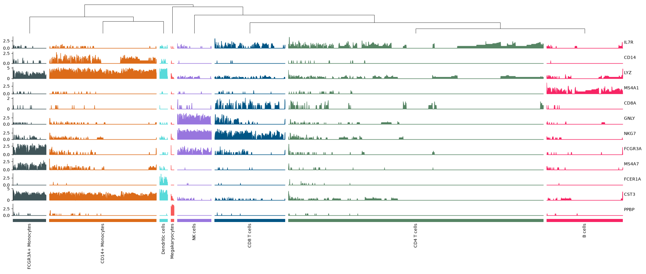
A tracksplot has no main heatmap. It is a stack of side plots on a shared axis, which you
can start with height=0 and init_main=False. Grouping, clustering and add_* still work.
Each track is one gene across all cells. Use A.X[:, gene] as a single reference, and
label= to name it.
tp = ma.ClusterBoard(
    pbmc, A.X[:, markers], obs_axis="col", width=20, height=0, init_main=False
)

tp.group_cols(A.obs["louvain"], spacing=0.005)
tp.add_dendrogram("top", add_base=False, size=1)
for gene in markers:
    tp.add_bottom(
        mp.Area(
            A.X[:, gene],
            add_outline=False,
            alpha=1,
            group_kws={"color": cell_colors},
            label=gene,
            label_loc="right",
        ),
        size=0.4,
        pad=0.1,
    )
tp.add_bottom(mp.Colors(A.obs["louvain"], palette=cmapper), size=0.1, pad=0.1)
tp.add_bottom(mp.Chunk(uni_cells, rotation=90))
tp.render();
Stacked Violin#
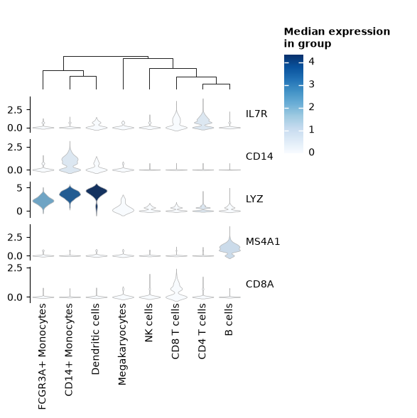
Same board as the tracksplot, one violin per gene, named by the same label= and
label_loc=.
Like sc.pl.stacked_violin, each violin is colored by its cell type’s median. That color
comes from a ScalarMappable, not from the plotter, so no plotter can draw a legend for
it. custom_legend takes a function returning a legend artist and adds it to the rest.
from legendkit import ColorArt
from matplotlib.cm import ScalarMappable
from matplotlib.colors import Normalize

sv_genes = markers[:5]
medians = pd.DataFrame({gene: by_cell_type(gene).median() for gene in sv_genes}).T
sm = ScalarMappable(
    norm=Normalize(medians.to_numpy().min(), medians.to_numpy().max()), cmap="Blues"
)

sv = ma.ClusterBoard(
    agg, A.layers["mean"][:, :], obs_axis="col", width=3, height=0, init_main=False
)

for gene in sv_genes:
    pdata = by_cell_type(gene)
    sv.add_bottom(
        mp.Violin(
            pdata,
            inner=None,
            linecolor=".7",
            linewidth=0.5,
            density_norm="width",
            palette=sm.to_rgba(pdata.median()).tolist(),
            label=gene,
            label_loc="right",
        ),
        size=0.5,
        pad=0.1,
        legend=False,
    )

sv.add_bottom(mp.Labels(A.obs.index))
sv.add_dendrogram("top")

sv.custom_legend(lambda: ColorArt(sm, title="Median expression\nin group"))
sv.add_legends(pad=0.3)
sv.render();
More information#
You can also write your own plotter. Marsilea’s documentation shows how.
The same references work on a MuData: import A from
mudata.acc and reach into a modality with A.mod["rna"].X[:, :]. Modalities share the
obs axis, so plots from different modalities line up on the rows with no reindexing.
Marsilea’s AnnData and MuData tutorial covers both.
sc.logging.print_header()
| Package | Version |
|---|---|
| pandas | 3.0.5 |
| anndata | 0.13.2 |
| numpy | 2.5.2 |
| scanpy | 1.14.0.dev31+g532d7b14c |
| marsilea | 0.8.1 |
| scipy | 1.18.0 |
| legendkit | 0.5.1 |
| matplotlib | 3.11.1 |
| Component | Info |
| Python | 3.13.1 (main, Jan 14 2025, 23:31:50) [Clang 19.1.6 ] |
| OS | macOS-26.5.2-arm64-arm-64bit-Mach-O |
| CPU | 14/14 logical CPU cores, arm |
| GPU | No GPU found |
| Updated | 2026-08-21 11:36 |
Dependencies
| Dependency | Version |
|---|---|
| charset-normalizer | 3.5.1 |
| statsmodels | 0.14.6 |
| python-dateutil | 2.9.0.post0 |
| pyparsing | 3.3.2 |
| numcodecs | 0.16.5 |
| annotated-types | 0.8.0 |
| executing | 2.2.1 |
| scverse-misc | 0.1.3 |
| tornado | 6.5.8 |
| debugpy | 1.8.21 |
| traitlets | 5.16.1 |
| pyzmq | 27.2.0 |
| pyarrow | 25.0.1 |
| packaging | 26.3 |
| stack-data | 0.6.3 |
| donfig | 0.8.1.post1 |
| h5py | 3.16.0 |
| kiwisolver | 1.5.0 |
| typing-inspection | 0.4.4 |
| matplotlib-inline | 0.2.2 |
| six | 1.17.0 |
| pydantic-settings | 2.15.0 |
| pydantic_core | 2.46.4 |
| defusedxml | 0.7.1 |
| seaborn | 0.13.2 |
| jupyter_client | 8.9.1 |
| legacy-api-wrap | 1.5 |
| pydantic | 2.13.4 |
| zarr | 3.3.0 |
| platformdirs | 4.11.3 |
| fonttools | 4.63.0 |
| typing_extensions | 4.16.0 |
| appnope | 0.1.4 |
| psutil | 7.2.2 |
| jupyter_core | 5.9.1 |
| session-info2 | 0.4.2 |
| prompt_toolkit | 3.0.53 |
| python-dotenv | 1.2.3 |
| PyYAML | 6.0.3 |
| asttokens | 3.0.2 |
| statannotations | 0.7.2 |
| ipywidgets | 8.1.9 |
| fast-array-utils | 1.5 |
| llvmlite | 0.49.0 |
| natsort | 8.4.0 |
| scikit-learn | 1.9.0 |
| ipython | 9.16.1 |
| patsy | 1.0.2 |
| cycler | 0.12.1 |
| Pygments | 2.21.0 |
| fastcluster | 1.3.0 |
| comm | 0.2.3 |
| numba | 0.67.0 |
| pure_eval | 0.2.3 |
| ipykernel | 7.3.0 |
| google-crc32c | 1.8.0 |
| joblib | 1.5.3 |
| pillow | 12.3.0 |
| wcwidth | 0.8.2 |
| narwhals | 2.25.0 |
| threadpoolctl | 3.6.0 |
Copyable Markdown
| Package    | Version                 |
| ---------- | ----------------------- |
| pandas     | 3.0.5                   |
| anndata    | 0.13.2                  |
| numpy      | 2.5.2                   |
| scanpy     | 1.14.0.dev31+g532d7b14c |
| marsilea   | 0.8.1                   |
| scipy      | 1.18.0                  |
| legendkit  | 0.5.1                   |
| matplotlib | 3.11.1                  |

| Dependency         | Version     |
| ------------------ | ----------- |
| charset-normalizer | 3.5.1       |
| statsmodels        | 0.14.6      |
| python-dateutil    | 2.9.0.post0 |
| pyparsing          | 3.3.2       |
| numcodecs          | 0.16.5      |
| annotated-types    | 0.8.0       |
| executing          | 2.2.1       |
| scverse-misc       | 0.1.3       |
| tornado            | 6.5.8       |
| debugpy            | 1.8.21      |
| traitlets          | 5.16.1      |
| pyzmq              | 27.2.0      |
| pyarrow            | 25.0.1      |
| packaging          | 26.3        |
| stack-data         | 0.6.3       |
| donfig             | 0.8.1.post1 |
| h5py               | 3.16.0      |
| kiwisolver         | 1.5.0       |
| typing-inspection  | 0.4.4       |
| matplotlib-inline  | 0.2.2       |
| six                | 1.17.0      |
| pydantic-settings  | 2.15.0      |
| pydantic_core      | 2.46.4      |
| defusedxml         | 0.7.1       |
| seaborn            | 0.13.2      |
| jupyter_client     | 8.9.1       |
| legacy-api-wrap    | 1.5         |
| pydantic           | 2.13.4      |
| zarr               | 3.3.0       |
| platformdirs       | 4.11.3      |
| fonttools          | 4.63.0      |
| typing_extensions  | 4.16.0      |
| appnope            | 0.1.4       |
| psutil             | 7.2.2       |
| jupyter_core       | 5.9.1       |
| session-info2      | 0.4.2       |
| prompt_toolkit     | 3.0.53      |
| python-dotenv      | 1.2.3       |
| PyYAML             | 6.0.3       |
| asttokens          | 3.0.2       |
| statannotations    | 0.7.2       |
| ipywidgets         | 8.1.9       |
| fast-array-utils   | 1.5         |
| llvmlite           | 0.49.0      |
| natsort            | 8.4.0       |
| scikit-learn       | 1.9.0       |
| ipython            | 9.16.1      |
| patsy              | 1.0.2       |
| cycler             | 0.12.1      |
| Pygments           | 2.21.0      |
| fastcluster        | 1.3.0       |
| comm               | 0.2.3       |
| numba              | 0.67.0      |
| pure_eval          | 0.2.3       |
| ipykernel          | 7.3.0       |
| google-crc32c      | 1.8.0       |
| joblib             | 1.5.3       |
| pillow             | 12.3.0      |
| wcwidth            | 0.8.2       |
| narwhals           | 2.25.0      |
| threadpoolctl      | 3.6.0       |

| Component | Info                                                 |
| --------- | ---------------------------------------------------- |
| Python    | 3.13.1 (main, Jan 14 2025, 23:31:50) [Clang 19.1.6 ] |
| OS        | macOS-26.5.2-arm64-arm-64bit-Mach-O                  |
| CPU       | 14/14 logical CPU cores, arm                         |
| GPU       | No GPU found                                         |
| Updated   | 2026-08-21 11:36                                     |