scanpy.pl.dotplot#
- scanpy.pl.dotplot(adata, var_names, groupby, *, use_raw=None, log=False, num_categories=7, categories_order=None, expression_cutoff=0.0, mean_only_expressed=False, standard_scale=None, title=None, colorbar_title='Mean expression\\nin group', size_title='Fraction of cells\\nin group (%)', figsize=None, dendrogram=False, gene_symbols=None, var_group_positions=None, var_group_labels=None, var_group_rotation=None, layer=None, swap_axes=False, dot_color_df=None, show=None, save=None, ax=None, return_fig=False, vmin=None, vmax=None, vcenter=None, norm=None, cmap='Reds', group_colors=None, dot_max=None, dot_min=None, smallest_dot=0.0, **kwds)[source]#
Make a dot plot of the expression values of
var_names.For each var_name and each
groupbycategory a dot is plotted. Each dot represents two values: mean expression within each category (visualized by color) and fraction of cells expressing thevar_namein the category (visualized by the size of the dot). Ifgroupbyis not given, the dotplot assumes that all data belongs to a single category.Note
A gene is considered expressed if the expression value in the
adata(oradata.raw) is above the specified threshold which is zero by default.An example of dotplot usage is to visualize, for multiple marker genes, the mean value and the percentage of cells expressing the gene across multiple clusters.
This function provides a convenient interface to the
DotPlotclass. If you need more flexibility, you should useDotPlotdirectly.- Parameters:
- adata
AnnData Annotated data matrix.
- var_names
str|Sequence[str] |Mapping[str,str|Sequence[str]] var_namesshould be a valid subset ofadata.var_names. Ifvar_namesis a mapping, then the key is used as label to group the values (seevar_group_labels). The mapping values should be sequences of validadata.var_names. In this case either coloring or ‘brackets’ are used for the grouping of var names depending on the plot. Whenvar_namesis a mapping, then thevar_group_labelsandvar_group_positionsare set.- groupby
str|Sequence[str] The key of the observation grouping to consider.
- use_raw
bool|None(default:None) Use
rawattribute ofadataif present.- log
bool(default:False) Plot on logarithmic axis.
- num_categories
int(default:7) Only used if groupby observation is not categorical. This value determines the number of groups into which the groupby observation should be subdivided.
- categories_order
Sequence[str] |None(default:None) Order in which to show the categories. Note: add_dendrogram or add_totals can change the categories order.
- figsize
tuple[float,float] |None(default:None) Figure size when
multi_panel=True. Otherwise thercParam['figure.figsize]value is used. Format is (width, height)- dendrogram
bool|str(default:False) If True or a valid dendrogram key, a dendrogram based on the hierarchical clustering between the
groupbycategories is added. The dendrogram information is computed usingscanpy.tl.dendrogram(). Iftl.dendrogramhas not been called previously the function is called with default parameters.- gene_symbols
str|None(default:None) Column name in
.varDataFrame that stores gene symbols. By defaultvar_namesrefer to the index column of the.varDataFrame. Setting this option allows alternative names to be used.- var_group_positions
Sequence[tuple[int,int]] |None(default:None) Use this parameter to highlight groups of
var_names. This will draw a ‘bracket’ or a color block between the given start and end positions. If the parametervar_group_labelsis set, the corresponding labels are added on top/left. E.g.var_group_positions=[(4,10)]will add a bracket between the fourthvar_nameand the tenthvar_name. By giving more positions, more brackets/color blocks are drawn.- var_group_labels
Sequence[str] |None(default:None) Labels for each of the
var_group_positionsthat want to be highlighted.- var_group_rotation
float|None(default:None) Label rotation degrees. By default, labels larger than 4 characters are rotated 90 degrees.
- layer
str|None(default:None) Name of the AnnData object layer that wants to be plotted. By default adata.raw.X is plotted. If
use_raw=Falseis set, thenadata.Xis plotted. Iflayeris set to a valid layer name, then the layer is plotted.layertakes precedence overuse_raw.- title
str|None(default:None) Title for the figure
- colorbar_title
str|None(default:'Mean expression\\nin group') Title for the color bar. New line character (n) can be used.
- cmap
Colormap|str|None(default:'Reds') String denoting matplotlib color map.
- standard_scale
Literal['var','group'] |None(default:None) Whether or not to standardize the given dimension between 0 and 1, meaning for each variable or group, subtract the minimum and divide each by its maximum.
- swap_axes
bool|None(default:False) By default, the x axis contains
var_names(e.g. genes) and the y axis thegroupbycategories. By settingswap_axesthen x are thegroupbycategories and y thevar_names.- return_fig
bool|None(default:False) Returns
DotPlotobject. Useful for fine-tuning the plot. Takes precedence overshow=False.- size_title
str|None(default:'Fraction of cells\\nin group (%)') Title for the size legend. New line character (n) can be used.
- expression_cutoff
float(default:0.0) Expression cutoff that is used for binarizing the gene expression and determining the fraction of cells expressing given genes. A gene is expressed only if the expression value is greater than this threshold.
- mean_only_expressed
bool(default:False) If True, gene expression is averaged only over the cells expressing the given genes.
- group_colors
Mapping[str,str|tuple[float,float,float] |tuple[float,float,float,float]] |None(default:None) A mapping of group names to colors. e.g.
{'T-cell': 'blue', 'B-cell': '#aa40fc'}. Colors can be specified as any valid matplotlib color. Ifgroup_colorsis used, a colormap is generated from white to the given color for each group. If a group is not present in the dictionary, the value ofcmapis used.- dot_max
float|None(default:None) If
None, the maximum dot size is set to the maximum fraction value found (e.g. 0.6). If given, the value should be a number between 0 and 1. All fractions larger than dot_max are clipped to this value.- dot_min
float|None(default:None) If
None, the minimum dot size is set to 0. If given, the value should be a number between 0 and 1. All fractions smaller than dot_min are clipped to this value.- smallest_dot
float(default:0.0) All expression levels with
dot_minare plotted with this size.- show
bool|None(default:None) Show the plot, do not return axis.
- save
str|bool|None(default:None) If
Trueor astr, save the figure. A string is appended to the default filename. Infer the filetype if ending on {'.pdf','.png','.svg'}. (deprecated in favour ofsc.pl.plot(show=False).figure.savefig()).- ax
_AxesSubplot|None(default:None) A matplotlib axes object. Only works if plotting a single component.
- vmin
float|None(default:None) The value representing the lower limit of the color scale. Values smaller than vmin are plotted with the same color as vmin.
- vmax
float|None(default:None) The value representing the upper limit of the color scale. Values larger than vmax are plotted with the same color as vmax.
- vcenter
float|None(default:None) The value representing the center of the color scale. Useful for diverging colormaps.
- norm
Normalize|None(default:None) Custom color normalization object from matplotlib. See Colormap normalization for details.
- kwds
Are passed to
matplotlib.pyplot.scatter().
- adata
- Return type:
- Returns:
If
return_figisTrue, returns aDotPlotobject, else ifshowis false, return axes dict
See also
DotPlotThe DotPlot class can be used to to control several visual parameters not available in this function.
rank_genes_groups_dotplot()to plot marker genes identified using the
rank_genes_groups()function.
Examples
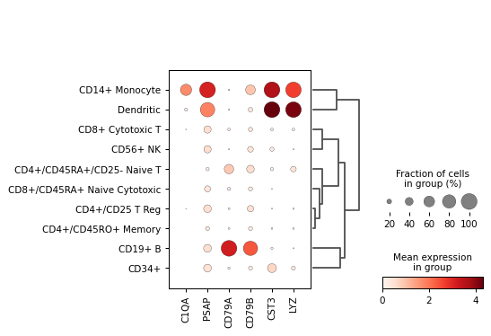
Create a dot plot using the given markers and the PBMC example dataset grouped by the category
'bulk_labels'.import scanpy as sc adata = sc.datasets.pbmc68k_reduced() markers = ['C1QA', 'PSAP', 'CD79A', 'CD79B', 'CST3', 'LYZ'] sc.pl.dotplot(adata, markers, groupby='bulk_labels', dendrogram=True)
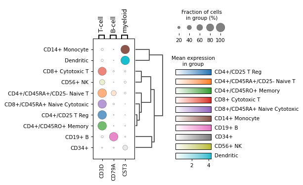
Grouping
var_namesas well and specifying group colors forgroupby:from matplotlib import cm markers = {'T-cell': 'CD3D', 'B-cell': 'CD79A', 'myeloid': 'CST3'} group_colors = dict(zip(adata.obs["bulk_labels"].cat.categories, cm.tab10.colors)) sc.pl.dotplot(adata, markers, groupby='bulk_labels', group_colors=group_colors, dendrogram=True)
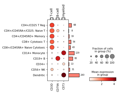
Get
DotPlotobject for fine tuningdp = sc.pl.dotplot(adata, markers, 'bulk_labels', return_fig=True) dp.add_totals().style(dot_edge_color='black', dot_edge_lw=0.5).show()
The axes used can be obtained using the
get_axes()methodaxes_dict = dp.get_axes() print(axes_dict)